this is a blog page about my media A- level course work, I will upload posts following the process of my work, the improvements and mistakes to try and get the best grades possible.
Friday, 5 February 2016
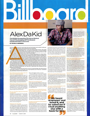
Billboard Coverspread analysis
I would say I prefer this cover spread to mixmags, there's more going on in this it looks less plain. I like the idea of including the masthead at the top again to remind the target audience what they're reading. the quotes are seen again, this shows ada theory that people will read the quotes first and look at the images first which is why I would include more images and quotes to give an overall summary to the article.
Subscribe to:
Post Comments (Atom)

No comments:
Post a Comment